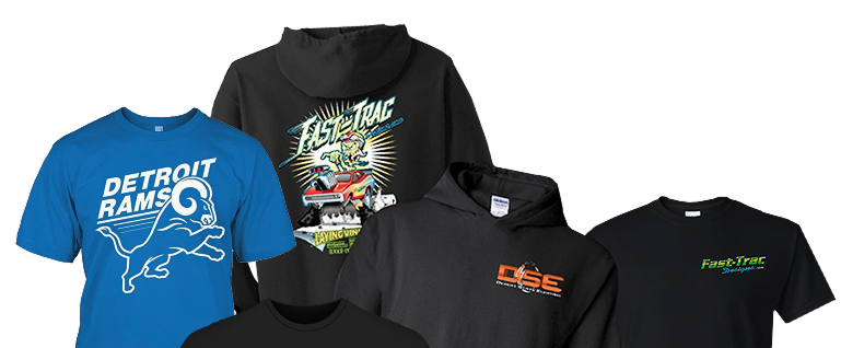
Ink opacity matters when screen printing on heathered shirts because it determines how effectively the printed design covers the fabric’s mixed-color surface. When ink is insufficiently opaque, underlying fabric colors can influence the appearance of logos, lettering, and graphics, potentially creating a more muted or uneven result than intended.
Heathered shirts have become a familiar option for company uniforms, event merchandise, team apparel, and promotional clothing. Their soft appearance and distinctive fabric texture make them attractive alternatives to traditional solid-color shirts.
However, the qualities that make heathered garments visually appealing can also influence their printing requirements.
For businesses and organizations in Phoenix, Arizona, understanding how ink opacity interacts with these fabrics can help establish realistic expectations before placing a custom apparel order.
What Makes Heathered Shirts Different From Solid-Color Fabrics?
Heathered shirts are distinguished by their blended or mottled appearance, which typically comes from combining yarns or fibers with different colors.
Unlike a uniformly dyed garment, a heathered shirt contains visible variations throughout the fabric.
These variations may be subtle, as with light gray heather, or more pronounced, as with darker charcoal, blue, or multicolored heather fabrics.
The appearance depends on the garment’s construction and fiber composition.
Many heathered shirts are made using combinations of cotton and polyester. Some include rayon or other fibers to achieve specific textures, draping characteristics, or garment properties.
However, not every heathered shirt uses the same materials or proportions.
How Does Mixed-Color Fabric Affect Printed Artwork?
When ink is applied to a solid-color shirt, the underlying surface is relatively consistent.
Heathered fabric introduces a more visually complex background.
If the ink allows some of the fabric color to show through, the resulting print may take on characteristics of the garment beneath it.
For example, a bright yellow graphic printed with relatively transparent ink on a dark charcoal heather shirt may appear less vibrant than expected.
The darker yarns can influence the perceived color, while lighter yarns may remain more noticeable in areas with limited ink coverage.
This interaction is not necessarily a printing defect.
Some designs intentionally use partially transparent ink to create a softer, vintage appearance.
The important distinction is whether that result matches the customer’s intended design.
What Does Ink Opacity Mean in Screen Printing?
Ink opacity describes how effectively a printed ink layer conceals the underlying fabric or previous ink layers.
An ink with high opacity provides stronger coverage, reducing the influence of the garment color beneath it.
An ink with lower opacity allows more of the underlying surface to affect the finished appearance.
Opacity is especially important when printing light-colored artwork onto dark or visually varied fabrics.
High-Opacity Ink and Strong Color Coverage
High-opacity formulations are often considered when a design requires bright colors, defined edges, and consistent coverage.
For example, a company may want a white logo on charcoal heather shirts.
If the selected ink provides sufficient coverage, the white design can appear relatively bright and distinct from the darker garment.
If the ink is more transparent, the logo may appear grayish or subdued.
The exact outcome also depends on ink deposit, garment construction, and the printing process.
High opacity does not automatically mean better printing for every project. It is one characteristic that must be matched to the intended design.
Lower-Opacity Ink and Softer Visual Effects
Some printed designs benefit from allowing the garment’s underlying texture to influence their appearance.
A vintage-inspired event shirt, for instance, may feature distressed lettering or an illustration intended to blend with the fabric.
In that situation, a softer print appearance may complement the artwork.
However, lower-opacity printing can be less appropriate when a design contains precise brand colors or elements requiring strong contrast.
The difference highlights why choosing a printing method involves more than selecting a shirt color and uploading artwork.
Why Can Heathered Fabric Change the Appearance of Printed Colors?
Heathered fabrics create a variable background that interacts with the printed ink.
The result depends on the opacity of the ink, the relative brightness of the garment, and the colors within the design.
A white or pale-colored print may behave differently on light gray heather than it does on dark navy heather.
Likewise, a saturated red design may appear more vivid on one garment than another.
Light Heather Versus Dark Heather
Light heathered garments generally provide a brighter background for printed artwork.
Dark inks often create strong contrast on these fabrics, although the exact effect depends on the garment color and ink formulation.
Dark heathered shirts present different challenges.
Light-colored ink must conceal enough of the darker surface to maintain its intended brightness.
If the ink coverage is insufficient, the graphic may appear faded or inconsistent with the approved artwork.
For businesses ordering screen print tee shirts with recognizable corporate colors, these differences can be particularly important.
A company logo that looks vibrant on a white shirt may not appear identical when printed onto charcoal heather.
Why Do Bright Brand Colors Require Additional Attention?
Corporate logos often rely on specific color combinations to maintain brand recognition.
When printed onto garments, those colors must be reproduced using a suitable ink system.
Heathered fabric can complicate this process because the underlying material may affect how the printed colors are perceived.
For instance, an orange logo printed over a dark heather background may appear duller if insufficiently opaque ink allows the garment color to influence the result.
Professional printing assessment can help determine whether the selected garment and ink combination will provide an acceptable visual outcome.
Exact color matching can be difficult across different materials and printing conditions, so expectations should be established before production.
How Does Fabric Composition Influence Ink Opacity?
Fiber composition influences how a garment responds to ink application and the heat used during curing.
Many heathered shirts contain polyester, cotton, or blends that include other fibers.
These materials have different properties, which can affect printing performance.
Cotton-Polyester Blends
Cotton-polyester blends are commonly used in casual and promotional apparel.
They combine characteristics of both fibers, although the exact feel and performance depend on the garment.
From a printing perspective, polyester content introduces considerations that may not be as significant with certain cotton garments.
One concern is dye migration.
Dye migration occurs when dyes from the garment move into the printed ink, potentially changing its appearance.
This can be especially noticeable when light-colored ink is printed onto darker polyester-containing fabrics.
Tri-Blend Fabrics
Tri-blend shirts commonly contain cotton, polyester, and rayon.
Their soft feel and relaxed appearance make them popular for casual branded merchandise.
However, their varied fiber composition can influence how ink sits on the surface and how the garment responds to production heat.
The printed design may have a different appearance from the same artwork applied to a heavier cotton garment.
These considerations are important when a business wants a specific combination of comfort, texture, and print visibility.
Why Do Fiber Percentages Matter?
Two shirts described as heather gray may contain substantially different fiber combinations.
One might be predominantly cotton, while another contains a higher percentage of polyester.
Although their colors look similar, their printing requirements may differ.
The fabric content can influence ink selection, opacity, and curing considerations.
An experienced screen printing shop can evaluate the selected garment’s specifications rather than assuming all heathered materials behave identically.
What Is the Relationship Between Ink Opacity and Dye Migration?
Ink opacity and dye migration are related considerations, but they are not the same issue.
Opacity concerns how effectively ink conceals the material beneath it.
Dye migration concerns the movement of garment dyes into the ink, which may cause discoloration after printing.
A print can initially appear opaque yet still experience dye migration under certain conditions.
Why Is Polyester Relevant?
Polyester fibers are commonly colored using dyes that can become mobile under elevated temperatures.
During the screen printing process, printed garments typically undergo heat curing to develop the ink’s intended properties.
Depending on the garment dye, ink formulation, and curing conditions, heat exposure can contribute to dye migration.
For example, a white design printed onto a red polyester-containing shirt may develop a pinkish appearance if dye from the garment migrates into the ink.
This does not happen with every polyester blend or printing application.
The risk depends on the specific materials and production conditions.
Can Highly Opaque Ink Prevent Dye Migration?
Not necessarily.
An ink can provide strong initial coverage without offering sufficient resistance to migrating dyes.
Specialized low-bleed formulations or other compatible printing materials may be considered for garments that present a higher migration risk.
However, no single ink selection guarantees that every fabric will behave identically.
Professional printers must consider garment composition, dye characteristics, ink compatibility, and appropriate curing requirements together.
This is one reason the technical details of the selected shirt matter as much as the artwork itself.
Why Might a White Underbase Be Used on Heathered Shirts?
A white underbase is a printed layer placed beneath other ink colors to create a more consistent foundation.
It is commonly considered when bright artwork must be reproduced on darker garments.
The underbase helps reduce the influence of the shirt color on the inks printed above it.
For example, a multicolored company logo may contain yellow, blue, and orange elements.
When those colors are printed directly onto a dark heather shirt, they may appear less vibrant than they would on a lighter garment.
A suitable underbase can improve their visual separation from the darker fabric.
Does Every Heathered Shirt Need an Underbase?
No.
Underbase requirements vary according to garment color, artwork, ink opacity, and the desired finished appearance.
A dark design printed onto light heather fabric may not require the same approach as bright multicolored artwork on charcoal heather.
Some projects may also benefit from an intentionally softer print.
An underbase adds another consideration to the decoration process, including how the finished design feels and how the ink layers interact.
The decision should be based on the complete project rather than a blanket rule that all heathered shirts require additional ink layers.
How Does an Underbase Affect Print Texture?
Adding an underbase can increase the amount of ink deposited onto the garment.
Depending on the printing method and ink system, this may influence the thickness or feel of the printed area.
A design with substantial ink coverage may feel different from one that uses a lighter application.
For businesses selecting soft, lightweight heathered shirts, this balance can be especially relevant.
The objective is to achieve appropriate print visibility while maintaining garment characteristics that meet the customer’s expectations.
How Does Ink Opacity Affect Different Types of Shirt Designs?
Not every design requires the same level of coverage.
A simple company name, detailed illustration, or multicolored event graphic may present different printing considerations.
Corporate Logos and Employee Apparel
Businesses often want their company logos to remain recognizable across employee uniforms and promotional clothing.
Clear lettering and consistent colors may be important, particularly when the shirts are worn during customer interactions.
For a Phoenix service company ordering charcoal heather work shirts, a sufficiently opaque white or light-colored design can help distinguish the logo from the garment.
However, the appropriate printing approach depends on the specific shirt and artwork.
The aim is to support brand recognition without assuming every garment will produce an identical color result.
Event Merchandise
Events frequently use artwork that includes gradients, distressed textures, or creative color combinations.
Some designs benefit from the underlying fabric texture contributing to the visual effect.
A vintage concert shirt, for example, may intentionally feature subdued colors that complement the heathered material.
A corporate conference shirt may instead require brighter graphics and more defined lettering.
Understanding these expectations helps determine whether stronger ink opacity is desirable.
School and Team Apparel
School organizations and recreational teams may order custom shirts featuring mascots, team names, or identifying colors.
These designs often need to remain visible from a reasonable distance.
If the chosen heathered fabric reduces the apparent contrast of the artwork, the final design may not deliver the intended effect.
A professional printing provider can assess the relationship between shirt color, print dimensions, and ink visibility before production.
Can Ink Opacity Affect the Consistency of Bulk Shirt Orders?
Yes. Ink opacity can influence how consistently artwork appears across garments, especially when an order includes different shirt colors or fabric compositions.
A business might order light gray heather shirts for office employees and dark charcoal heather shirts for field personnel.
Even if both garments use the same artwork, the perceived colors may differ because the underlying fabrics are not identical.
Different garments may also require different production considerations.
Why Does Shirt Style Matter?
Garment suppliers often offer several heathered styles with distinct fabric weights, fiber blends, and surface textures.
Selecting multiple styles within the same apparel program can introduce variations in how ink interacts with each shirt.
For larger orders, documenting the approved garment styles and artwork expectations can help support a consistent appearance.
However, identical artwork does not guarantee completely identical results across different materials.
The practical goal is to establish acceptable visual consistency while accounting for the characteristics of each garment.
What About Reorders?
Reorders may involve different garment batches or product availability.
If the replacement shirt differs from the original in fabric composition or color, the printed design may also appear different.
This consideration is particularly important for organizations maintaining branded apparel over time.
Working with a professional printer allows businesses to discuss garment specifications and potential differences before placing additional orders.
Why Is Professional Screen Printing Important for Heathered Apparel?
Heathered apparel requires decisions that connect the intended artwork with the physical characteristics of the garment.
Ink opacity is only one part of that relationship.
The selected fabric, garment color, fiber content, ink system, and curing requirements all contribute to the final appearance.
Professional evaluation helps identify potential concerns before they affect a completed apparel order.
For example, a business may prefer a lightweight heathered shirt because of its comfort and appearance but also require a bright, highly visible logo.
A printing provider can evaluate whether those preferences work together or whether the project requires different garment or production considerations.
Businesses seeking a professional Screen Printing Service in Phoenix can benefit from discussing their selected apparel, artwork, and expected print appearance with an experienced provider.
The purpose of that discussion is not simply to produce a print. It is to establish how the design should look on the actual garment and what production considerations may affect the result.
What Should Businesses Understand Before Choosing Heathered Shirts?
The most important consideration is that heathered fabric is not a neutral background.
Its mixed-color appearance, fiber composition, and surface characteristics can influence the final printed design.
A garment that looks attractive without decoration may produce unexpected results when paired with certain ink colors.
For example, a bright logo may require a different approach on a dark heather shirt than on a light cotton shirt.
Likewise, a distressed design intended to appear subtle may not require the same opacity as a highly visible company emblem.
Businesses should also recognize that fabric appearance and printing performance are separate considerations.
Two garments may look similar in a product catalog but respond differently during production.
When reviewing apparel options, the preferred outcome should guide the conversation.
Does the organization need strong logo contrast? Is a softer, vintage appearance desirable? Will the same artwork appear on multiple shirt styles?
These questions are best resolved through professional project planning rather than assumptions based on digital previews alone.
Final Thoughts: Why Ink Opacity Deserves Attention
Ink opacity plays a significant role in how screen-printed designs appear on heathered shirts.
It affects color visibility, contrast, and the extent to which the garment’s underlying texture influences the finished artwork.
Heathered fabrics introduce additional considerations because their mixed-color surfaces and varied fiber compositions can behave differently from traditional solid-color cotton garments.
For businesses, schools, teams, and organizations ordering custom apparel, understanding these differences can help prevent unrealistic expectations and support better printing decisions.
Strong color coverage is not always the goal. Some projects benefit from softer, more subdued designs, while others require clearly defined colors and highly visible logos.
The best approach depends on the garment, artwork, and intended use.
By considering these factors together, professional screen printing providers can help customers select apparel and printing options that complement their designs while accounting for the technical characteristics of heathered fabrics.
About PHX Screen Printing
PHX Screen Printing is a Phoenix, Arizona-based custom apparel provider and a division of Fast-Trac Designs, serving businesses, schools, teams, and organizations throughout the greater Phoenix area. They specialize in screen printing and embroidery, with services covering custom T-shirts, uniforms, and branded apparel. Located at 302 W. Melinda Lane, Suite 3, Phoenix, AZ 85027, they can be reached at 602-314-4813; customers can also find their office on Google Maps.